My targets audience for my magazine is young teenage girls. I have chosen this because when I did my questionaire I focused mainly on this group of people which meant I got results on what their favourite things are. They would also be my target audience because these are the groups that appeal to the Pop genre.
Wednesday, 21 April 2010
What Media Institution would distribute my magazine?
My magazine would be sold on a large scale. It would be sold in shops suchas WH Smith or local newsagents all over the country. As my magazine is a feminine magazine, the publisher could strike deals with clothing shops so that the weekly issue could be sold there. The shops could therefore advertise their items within the magazine to also help their sales.
I would create a website for my magazine. On this website i would include interviews that are recorded with artists, advertising for sponsors and updates on up and coming festivals. Another useful thing for readers would be if I put links on my websites to websites where readers could buy tickets to the concerts where they could see their favourite artists.
Introduction
For my AS Media Coursework I showed the pre production, production and final pages of a music magazine. I enjoyed this coursework as I was able to be creative and use my ideas throughout the creation of my magazine. Mostly I enjoyed the photoshoot as i was able to take control and make decisions about what went into my magazine.
I have learnt to use Photoshop and InDesign which will help me into my second year of my media A Level.
Overall I am pleased with my final pages as they symbolise the genre of Pop well and show consistency throughout the creation. I think that I have shown development of my ideas to a good standard and reasons for why I've chosen certain things have been shown clearly. I look forward to the second year of my A Level.
Preliminary Front cover
For my preliminary task this is the front cover that i designed. In comparision to my Final Cover this is awful. In my opinion my techniques have improved as I have thought about the layout better, use of colour and font. This Front cover does not look consistant at all and has no sort of theme to it. The title is plain and does not catch the readers eye and the image is dull. The image also doesnt make a connection with the audience.
Final Contents Page
In my contents page i used the same colours scheme to show consistence through the creation of my music magazine. I wanted to keep it simple as I feel it is important that the contents is about the information it gives rather than the images. However I did add a image of my model smiling and laughing which symbolises the personality of my target audience. This image is to reflect my model during a dance routine she is making but also having fun whilst being at work.
There is only one social group shown through my contents which is teenage girls.
The pink feminine colours symbolise this and the striking bright pink in the mast head make a clear, fun contrast.
I feel I have challenged the stereotypical pop magazine contents page as mine is more simple. Howver I feel young girls would prefer this as then they can findstraight away where they're favourite articles are.
Final Front Cover
For my front cover i used alot of typical music magazine conventions. I used the big front cover image to create a strong connection with my audience. My model is making strong eye contact my looking straight at the camera.
The idealogy my magazine has is that it is following the Pop genre. This is made clear at first look as the title is 'PopGospel'. The pose of my model is a silly pose that a young teenage girl would do, as this is something similar to what my readers would do they would then automatically be attracted to my magazine. I have used my plugs and lures to anchor down my image just as a typical music magazine would do. By choosing font colours that stand out against the text this makes the text stand out alot to the readers.
Final Cover Image
This was my final cover image. I used photoshop to cut around the image in order to make a clear cut so i could then use my own background for my magazine cover.
SLR Camera - At first i struggled to use the camera as it had lots of different settings. However with help i was able to adjust the focus, and contrast in order to have success in taking all my images. If doing another photoshoot i would make sure i adjusted the camera better with the lighting.
Tuesday, 20 April 2010
Evidence for photoshoot
Mood Board
Graphs
My graphs helped me to see clearly what my targets audience favoured and to decide upon important decisions, suchas colour scheme, music genre and what ages prefere what types of music. I was successful with my target audience research as i came up with a consistent set of result which all made sense as far as my target audience were concerned. I included a interview in my double page spread because when i handed out my questionaire most my target audience said that they prefered reading interviews. I also went on to make the final colour scheme for my magazine bright colours as this is another aspect that my target audience favoured.
Questionairre
I constructed my magazine based on what my target audience gave me feedback on after handing out my questionaire. I asked a question that was "do you prefere more images or more text" my audience voted "more images" which then helped me during my photoshoot and i knew that i needed to take lots of different images to therefore please my audience.
Font Progression
I chose three Logo names that i prefered then decided on my favourite, this was the best thing to do as it helped me to narrow down my ideas. By researching different fonts i was able to choose which one suited my genre more easily, i ended up choosing a simple one that i felt wouldnt take attention away from the rest of my front cover.
Conventions of a Music Magazine - OUTSIDE
I followed the typical convention of a music magazine and was successful in including most things that you would usually see on a music magazine. I included things suchas the price, barcode and logo which made my magazine cover realistic. The image is eyecatching and one that catches the audiences attention straight away as my model striking a pose that creates a strong connection with the audience.
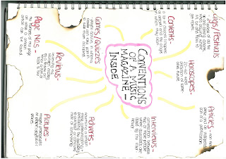
Conventions of a Music Magazine - INSIDE
In what ways does your magazine use, develop or challenge forms and conventions of real music magazines? Contents page
When looking at contents pages this helped me mostly with how i would choose the layout for my own contents. I developed conventions such as the title from this contents and how it is placed in the top left hand corner of the page, the way that the number of the pages are different colours to the rest of the font so that the reader can see clearly where the pages are. I didnt use as many images in my contents as i feel the most important thing about the contents is that is tells the readers where certain articles are within the magazine.
Deconstruction of Front Cover
I looked at magazines such as Smash Hits and NME to help me come up with ideas for the layout of my front cover. I also looked at fashion magazines when it came to deciding on the pose for my model. I looked at pop stars such as Pixie Lott and what poses she used when modelling in magazines.
The changes that I made were in the fonts and colours within my front cover. Originally I had a white background with a black font, but decided that the pink font would suit the genre more. I used Photoshop to create my front cover. Specifically, I used the magic wand tool to cut out the image of my model to ensure that I didn't have any unecessary background.
Feedback from other students helped me decide on the price of my magazine, colour scheme and image. I took a number of pictures in my photo shoot and asked my target audience which one was their favourite. This helped me choose my final front cover image. I chose pink as my background because my target audience is female and in a questionnaire that I conducted, the majority favoured bright colours.
My magazine shows belief in the pop genre through the feminine colours, the masthead being Pop Gospel, and the image of a teenage blonde girl, which represents the target audience.
My magazine represents one main social group: teenage girls, through the fonts, colour scheme and images.
My magazine conforms to steriotypes because it is a typical girly magazine.
In what ways does your magazine use, develop or challenge forms and conventions of real music magazines? Front cover
In this deconstruction of a front cover i was able to see the way that other music magazines choose the layout of their magazines. The way that the cover image is a close up of just the models face appealed to me as i thought it made a strong connection with the audience. I developed this idea in my front cover as i chose to use my model pulling a pose which reflected the Pop genre which is why she has a happy smile on her face. I developed the plugs and lures from other music magazine i deconstructed as i put my plugs around the image, down the sides of the the front cover.
Subscribe to:
Posts (Atom)